
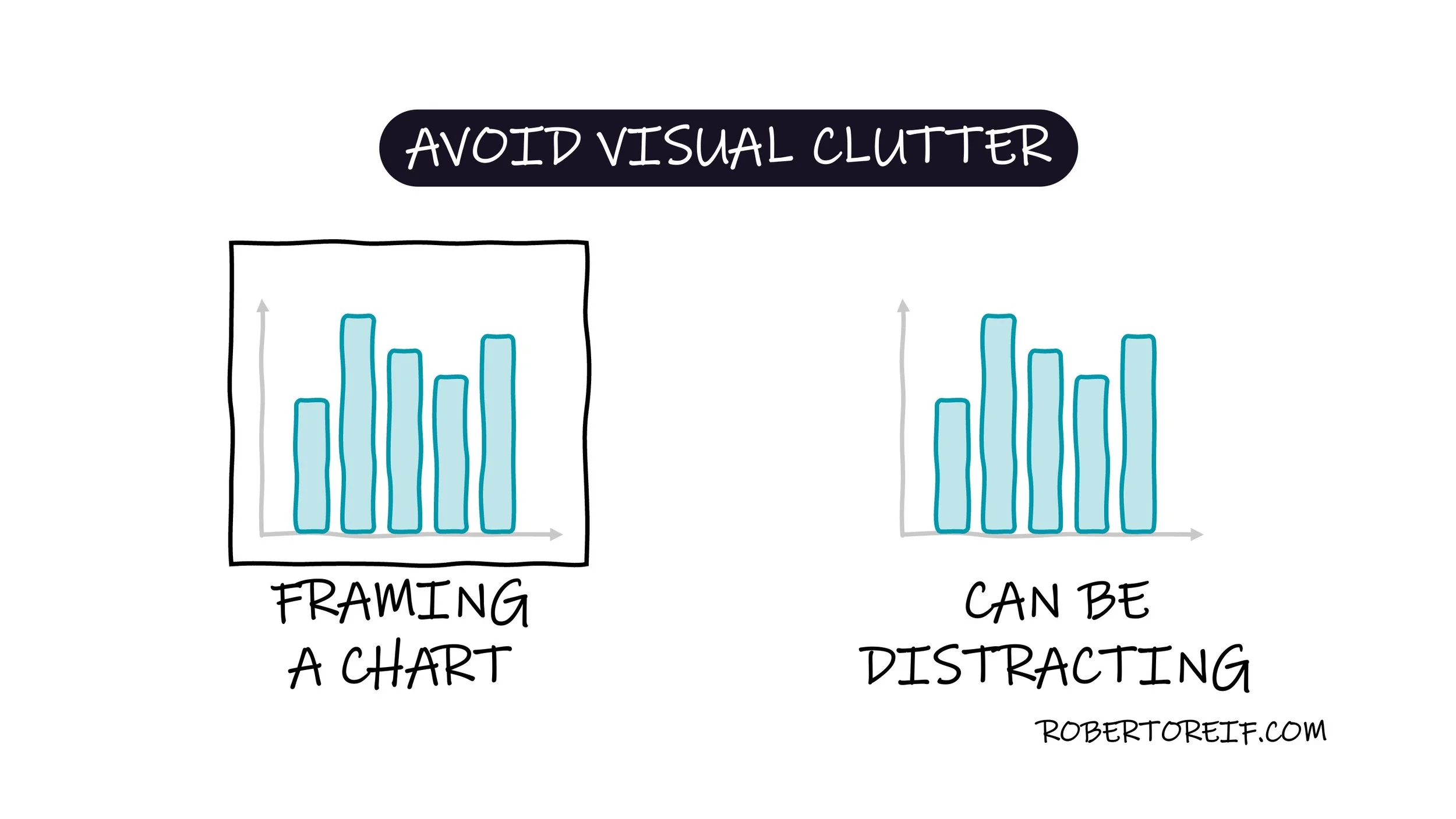
A common way presenters unintentionally increase cognitive load is by adding unnecessary visual elements, such as heavy frames or borders around their charts. While these design choices can make the chart feel “contained,” they also increase the data-to-ink ratio, meaning more ink is used for decoration rather than for communicating meaningful information. This extra ink creates distraction and forces our brains to work harder to focus on the data itself.
How else have you noticed visual clutter show up in charts or presentations?
Quisque iaculis facilisis lacinia. Mauris euismod pellentesque tellus sit amet mollis.