
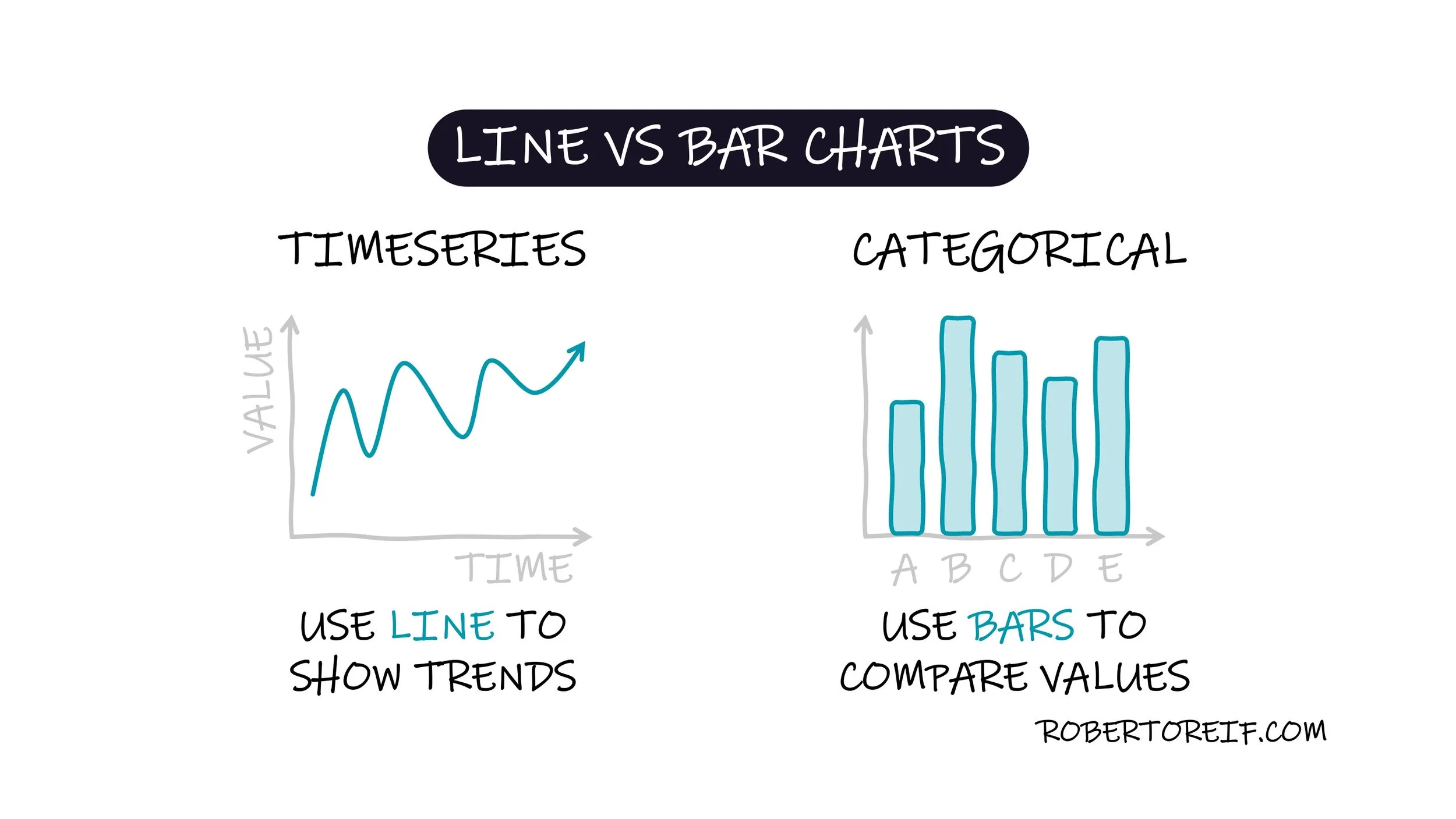
When visualizing data, choosing the right chart type is essential for telling a clear and accurate story. Two of the most commonly used, and often confused, chart types are line charts and bar charts.
Line charts are best used for showing trends over time. They highlight how values rise or fall across a continuous timeline. For example, if you want to show monthly website traffic for the past year, a line chart makes it easy to spot upward trends, seasonal dips, or sudden spikes.
Bar charts, on the other hand, are ideal for comparing discrete categories. They help the viewer observe which category is bigger, smaller, or similar. For instance, if you want to compare sales across different product lines, a bar chart makes those differences obvious.
Choosing the right chart type helps your audience grasp your message faster and with less cognitive effort.
How do you decide between these chart types in your own work?
Quisque iaculis facilisis lacinia. Mauris euismod pellentesque tellus sit amet mollis.