
Recently I was reading an interesting article by Nate Silver. In it there is a chart that compares the Post-debate “instant” poll, net margin (horizontal axis) versus the Gain or loss in horse-race poll after debate (vertical axis). The data comes from CNN and Gallup polls of presidential debates since 1984. A copy of the chart is observed below.
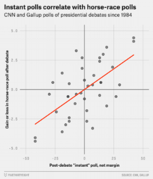
What caught my attention is that the chart is “rotationally invariant”. In other words, the chart looks the same when it is rotated by 180 degrees. This can be visualized below. The left chart is the original one, and it has been recolored blue. The right one, has been rotated by 180 degrees, and it has been recolored orange.

The outcome is that the data-points have not moved. Below we have overlapped the two charts (and slightly shifted them in the horizontal direction). Every blue dot has a twin orange dot!

In this example, the effect occurs because the data in both axis (horizontal and vertical) contain information that is inversely correlated. For example, if a candidate gained 5%, the other candidate lost the same amount. Therefore, when we include the data from both candidates, a dot is placed both in the +5% and -5%. Since both axes have this correlation, we obtain the rotationally invariant chart.
It is not often that I encounter these types of charts, but it makes me wonder if it is redundant to present the data this way. The symmetry may hide minutiae that lie within the data!