
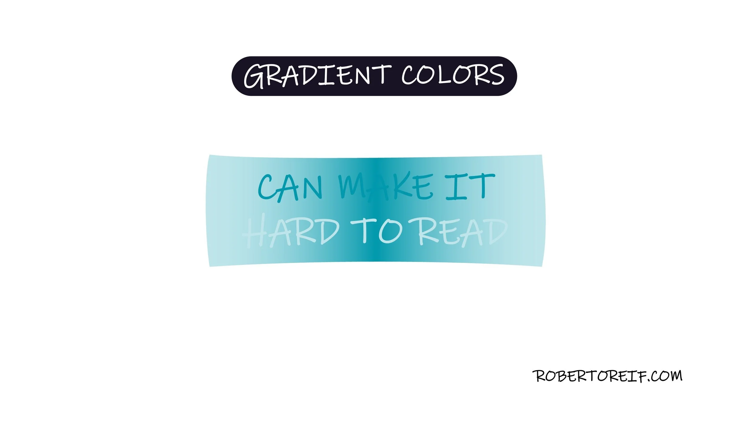
The use of gradient colors can look visually appealing, but they need to be used carefully in data visualization and slide design. When a background (or foreground) shifts between multiple colors, it can reduce contrast and make text, charts, or images harder to read. It increases cognitive load and forces the brain to work harder to process the information.
For example, placing white text over a light-to-dark gradient may look clean at first glance, but parts of the text may blend into the lighter areas, while other parts remain readable. The result is uneven visibility and visual strain.
A more effective approach is to use solid background colors paired with contrasting solid foreground. This creates clarity, improves accessibility, and keeps attention on the message rather than the design.
What’s your take on using gradients in visual design?
