
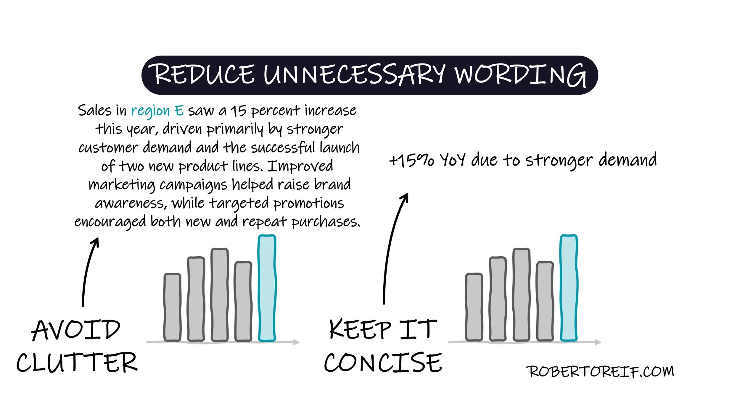
When working with charts, it’s important to minimize cognitive load. One common issue I often encounter is the overuse of text to explain what the chart already shows. This becomes especially problematic in slide decks, where too much wording draws attention away from the presenter. The goal is for the audience to listen to you while using the chart as supporting material, not to read paragraphs of text on the slide.
For example, instead of writing along text explanation as shown in the graph, a simple label like “+15% YoY due to stronger demand” placed near the bar communicates the same idea with far less clutter.
What other techniques have you used to help reduce cognitive load?
