
At first glance, bar charts and histograms may seem interchangeable. After all, both use rectangular bars to visualize data. However, despite their visual similarity, they serve very different purposes and are built on different assumptions about the data.
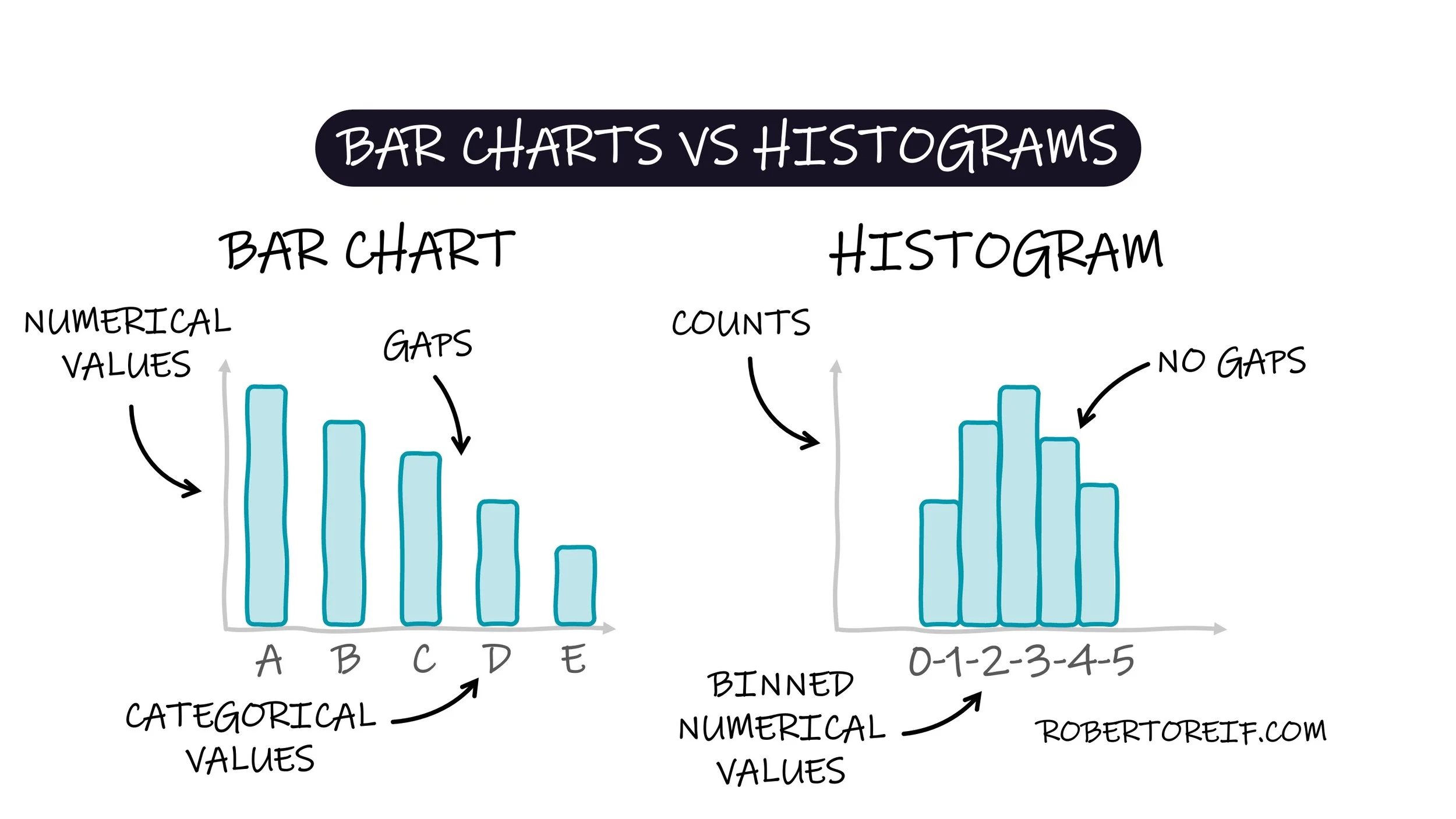
A bar chart is typically used to represent categorical data. Each bar corresponds to a distinct category (e.g., types of fruits, departments in a company), and the height of the bar reflects a numerical value such as revenue, percentage, or any other metric. The bars are usually separated by gaps to emphasize that the categories are independent of each other. The order along the x-axis can represent a logical pattern such as alphabetically, sorted by value, or ordered logically based on the context.
In contrast, a histogram is used to represent continuous numerical data. It shows how the data are distributed across intervals, or “bins.” The x-axis represents the range of values divided into these intervals, and the y-axis shows the frequency (or count) of data points within each bin. Unlike bar charts, histograms have no gaps between bars, reflecting the continuous nature of the data. You might also encounter a normalized histogram, where the y-axis represents a proportion or probability, such that the total area under the bars equals 1.
Understanding the distinction between these two is essential for effective data visualization and communication.
Have you noticed other subtle differences or misuses of these two charts in the real world?