• About
  • Images
  • Blog
  • Talks
  • Contact
Menu

Roberto Reif

Technology and Data Trainings

Your Custom Text Here

Roberto Reif

  • About
  • Images
  • Blog
  • Talks
  • Contact

Managing Overlapping Data Points

August 26, 2025 Roberto Reif

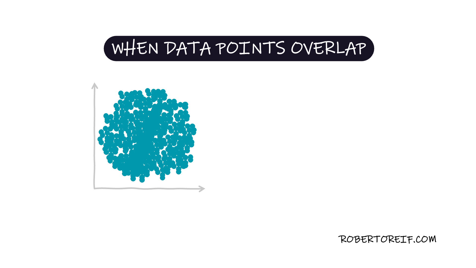
When visualizing data, especially in scatter plots, overlapping points can obscure patterns. Instead of using solid colors, applying transparency helps reveal data density, making trends and relationships clearer. This technique improves readability without distorting the visualization.

Have you come across effective uses of transparency in data visualization?

← Energy Levels of People Pleasers Vs. People who Hold BoundariesPIE CHARTS: For Emphasis Avoid Explosion, Use Color Highlights →