
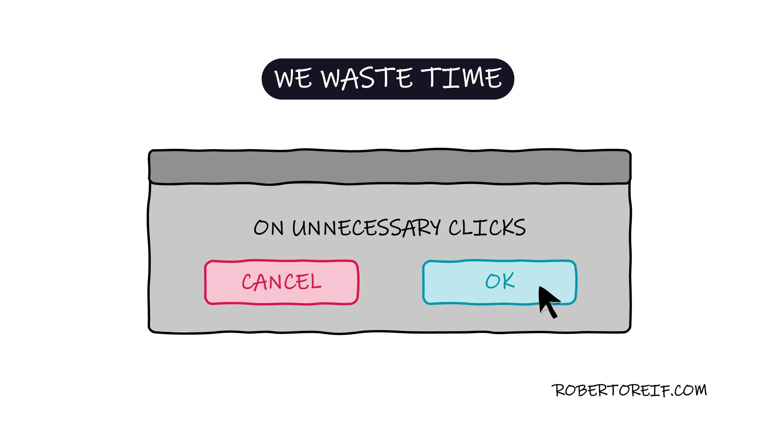
When designing digital experiences, we often underestimate how much time users spend clicking. Every interaction that requires a click demands attention and mental energy. While some clicks are essential (like accepting terms or confirming a payment), many are simply friction disguised as safety or structure.
Unnecessary clicks add up. A redundant confirmation message. A second “Are you sure?” after the user already made a deliberate choice. A multi-step process that could easily be one. Individually, these moments feel small. Collectively, they drain time, focus, and patience.
Good design is about thoughtful restraint, not about adding more safeguards or more steps. Each click should have a clear purpose. If an action does not reduce risk, increase clarity, or improve accuracy, it likely increases cognitive load instead. And cognitive load matters. When users are forced to process repetitive or redundant interactions, their mental bandwidth shifts away from their goal and toward navigating the interface itself.
If we are fortunate enough to have a user’s attention, we should respect it. The goal of great user experiences is not to slow users down, it’s to help them move forward with confidence and clarity. That means reducing friction, simplifying flows, and eliminating unnecessary confirmations.
In short:
Every click should earn its place.
What are your thoughts?
