
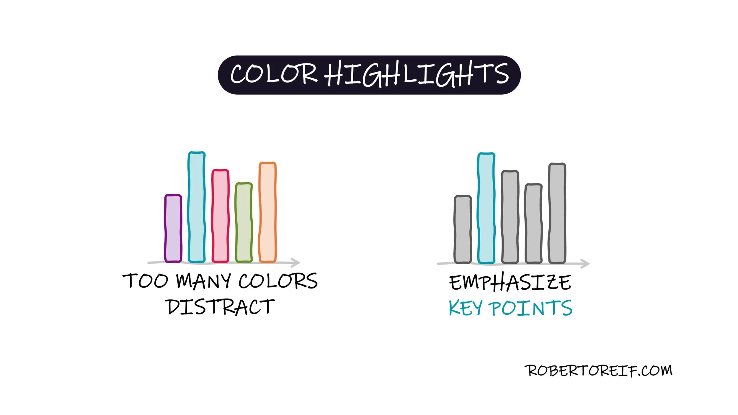
When designing charts or visualizations, it's easy to fall into the trap of using too many colors. While the intent is often to make things more engaging or comprehensive, the result can be the opposite: increased cognitive load, visual clutter, and difficulty focusing on what truly matters.
A more effective approach is to minimize the color palette and use strategic highlighting. By keeping most of the chart in neutral tones and applying bold or distinct colors only to the key data points, you guide the viewer’s attention exactly where you want it. This method improves clarity and strengthens the message behind your visualization.
Think of color as a tool for emphasis, not decoration.
Highlight with purpose.
Reduce visual noise.
Increase impact.
How do you approach color in your data visualizations?