
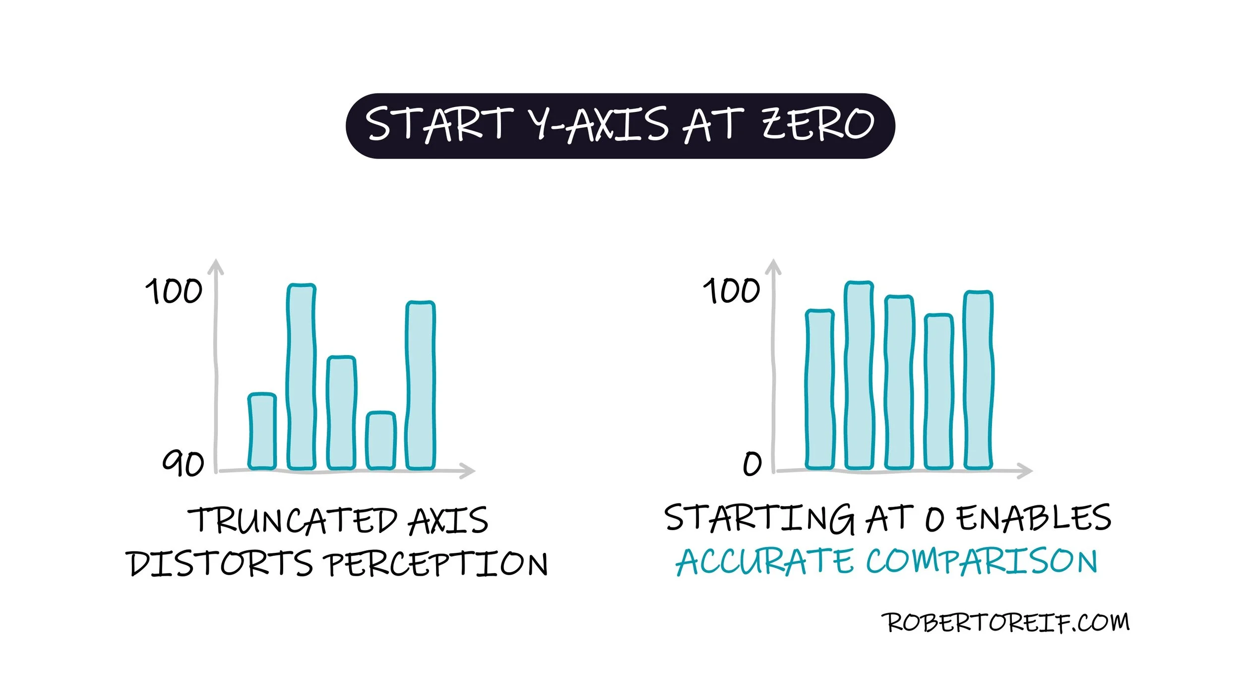
When we look at a bar chart, our brains instinctively compare the lengths of the bars. We also tend to assume that the y-axis begins at zero. Because of this, if a bar chart starts the y-axis at a higher value, for example, 90 instead of 0, the differences between bars can appear much larger or smaller than they truly are. This distorts the storyline that the data is telling.
How else have you been manipulated by charts?
