
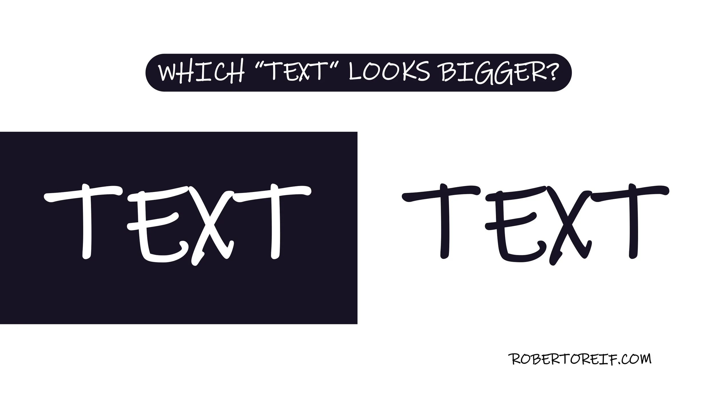
When designing visuals that include both foreground and background elements, color contrast plays a powerful role in how we perceive size, weight, and importance. Our eyes don’t interpret all color combinations equally, and this can subtly influence what stands out to us first.
In the image, the text on the left uses light lettering on a dark background. It appears larger and bolder than the text on the right, which uses dark text on a light background; even though both are the same size. The difference isn’t in the typography; it’s in how contrast affects perception.
This effect can be useful in slide design. By placing lighter text on darker backgrounds, you can create visual hierarchy, draw attention to key ideas, and guide your audience’s focus without adding more words or graphics.
What other slide design techniques have you found effective?
